


 Syntax
| Visual Basic (Declaration) | |
|---|---|
Public Property IsPlaying As Boolean | |
| C# | |
|---|---|
public bool IsPlaying {get; set;} | |
Remarks
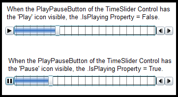
A value of True means the animating of the thumb(s) is occurring. A value of False means no animation is occurring. The default TimeSlider Control uses a ToggleButton for the PlayPauseButton to control the animations. When the Pause icon is visible that means animation is occurring (i.e. .IsPlaying=True). When the Play icon is visible, that means the animation has stopped (i.e. .IsPlaying=False). See the following screen shot for a visual depiction:
Under most circumstances it is not necessary to set the IsPlaying Property via code as this Property is automatically managed as part of the default TimeSlider Control. It is possible to modify the default behavior of the PlayPauseButton sub-component of the TimeSlider by editing its Control Template; see the code example in this document.
Example
How to use:
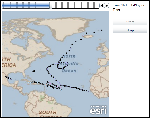
Once the FeatureLayer has initialized the customized TimeSlider will have all of the necessary Properties set in order to run. The normal PlayPauseButton has been removed as part of the Control Template of the TimeSlider. Use the 'Start' and 'Stop' buttons to control the functionality of the TimeSlider's animation via the .IsPlaying Property.
The XAML code in this example is used in conjunction with the code-behind (C# or VB.NET) to demonstrate the functionality.
The following screen shot corresponds to the code example in this page.
| XAML |  Copy Code Copy Code |
|---|---|
<!-- Don't forget to add the xml namespace reference: xmlns:esriToolkitPrimitives="clr-namespace:ESRI.ArcGIS.Client.Toolkit.Primitives;assembly=ESRI.ArcGIS.Client.Toolkit" --> <Grid x:Name="LayoutRoot" Background="White"> <Grid.Resources> <!-- The majority of the XAML that defines the ControlTemplate for the Bookmark Control was obtained by using Microsoft Blend. See the blog post entitled: 'Use control templates to customize the look and feel of ArcGIS controls' at the following Url for general How-To background: http://blogs.esri.com/Dev/blogs/silverlightwpf/archive/2010/05/20/Use-control-templates-to-customize-the-look-and-feel-of-ArcGIS-controls.aspx --> <Style x:Key="TimeSliderStyle1" TargetType="esri:TimeSlider"> <Setter Property="IsTabStop" Value="True"/> <Setter Property="Foreground"> <Setter.Value> <LinearGradientBrush EndPoint="0.5,1" StartPoint="0.5,0"> <GradientStop Color="#00ffffff"/> <GradientStop Color="#FF326FC0" Offset="0.5"/> <GradientStop Color="#00ffffff" Offset="1"/> </LinearGradientBrush> </Setter.Value> </Setter> <Setter Property="Background" Value="White"/> <Setter Property="BorderBrush" Value="Black"/> <Setter Property="BorderThickness" Value="1"/> <Setter Property="Template"> <Setter.Value> <ControlTemplate TargetType="esri:TimeSlider"> <Grid> <Grid.Resources> <!-- Comment out the entire 'Style' section of the PlayPauseToggleButtonStyle since it is not used in our example! --> <!-- <Style x:Key="PlayPauseToggleButtonStyle" TargetType="ToggleButton"> <Setter Property="Background" Value="#FF1F3B53"/> <Setter Property="Foreground" Value="#FF000000"/> <Setter Property="Padding" Value="3"/> <Setter Property="BorderThickness" Value="1"/> <Setter Property="BorderBrush"> <Setter.Value> <LinearGradientBrush EndPoint="0.5,1" StartPoint="0.5,0"> <GradientStop Color="#FFA3AEB9" Offset="0"/> <GradientStop Color="#FF8399A9" Offset="0.375"/> <GradientStop Color="#FF718597" Offset="0.375"/> <GradientStop Color="#FF617584" Offset="1"/> </LinearGradientBrush> </Setter.Value> </Setter> <Setter Property="Template"> <Setter.Value> <ControlTemplate TargetType="ToggleButton"> <Grid> <VisualStateManager.VisualStateGroups> <VisualStateGroup x:Name="CommonStates"> <VisualState x:Name="Normal"/> <VisualState x:Name="MouseOver"> <Storyboard> <DoubleAnimationUsingKeyFrames Storyboard.TargetProperty="Opacity" Storyboard.TargetName="BackgroundAnimation"> <SplineDoubleKeyFrame KeyTime="0" Value="1"/> </DoubleAnimationUsingKeyFrames> <ColorAnimationUsingKeyFrames Storyboard.TargetProperty="(Rectangle.Fill).(GradientBrush.GradientStops)[1].(GradientStop.Color)" Storyboard.TargetName="BackgroundGradient"> <SplineColorKeyFrame KeyTime="0" Value="#F2FFFFFF"/> </ColorAnimationUsingKeyFrames> <ColorAnimationUsingKeyFrames Storyboard.TargetProperty="(Rectangle.Fill).(GradientBrush.GradientStops)[2].(GradientStop.Color)" Storyboard.TargetName="BackgroundGradient"> <SplineColorKeyFrame KeyTime="0" Value="#CCFFFFFF"/> </ColorAnimationUsingKeyFrames> <ColorAnimationUsingKeyFrames Storyboard.TargetProperty="(Rectangle.Fill).(GradientBrush.GradientStops)[3].(GradientStop.Color)" Storyboard.TargetName="BackgroundGradient"> <SplineColorKeyFrame KeyTime="0" Value="#7FFFFFFF"/> </ColorAnimationUsingKeyFrames> </Storyboard> </VisualState> <VisualState x:Name="Pressed"> <Storyboard> <ColorAnimationUsingKeyFrames Storyboard.TargetProperty="(Border.Background).(SolidColorBrush.Color)" Storyboard.TargetName="Background"> <SplineColorKeyFrame KeyTime="0" Value="#FF6DBDD1"/> </ColorAnimationUsingKeyFrames> <DoubleAnimationUsingKeyFrames Storyboard.TargetProperty="Opacity" Storyboard.TargetName="BackgroundAnimation"> <SplineDoubleKeyFrame KeyTime="0" Value="1"/> </DoubleAnimationUsingKeyFrames> <ColorAnimationUsingKeyFrames Storyboard.TargetProperty="(Rectangle.Fill).(GradientBrush.GradientStops)[0].(GradientStop.Color)" Storyboard.TargetName="BackgroundGradient"> <SplineColorKeyFrame KeyTime="0" Value="#D8FFFFFF"/> </ColorAnimationUsingKeyFrames> <ColorAnimationUsingKeyFrames Storyboard.TargetProperty="(Rectangle.Fill).(GradientBrush.GradientStops)[1].(GradientStop.Color)" Storyboard.TargetName="BackgroundGradient"> <SplineColorKeyFrame KeyTime="0" Value="#C6FFFFFF"/> </ColorAnimationUsingKeyFrames> <ColorAnimationUsingKeyFrames Storyboard.TargetProperty="(Rectangle.Fill).(GradientBrush.GradientStops)[2].(GradientStop.Color)" Storyboard.TargetName="BackgroundGradient"> <SplineColorKeyFrame KeyTime="0" Value="#8CFFFFFF"/> </ColorAnimationUsingKeyFrames> <ColorAnimationUsingKeyFrames Storyboard.TargetProperty="(Rectangle.Fill).(GradientBrush.GradientStops)[3].(GradientStop.Color)" Storyboard.TargetName="BackgroundGradient"> <SplineColorKeyFrame KeyTime="0" Value="#3FFFFFFF"/> </ColorAnimationUsingKeyFrames> </Storyboard> </VisualState> <VisualState x:Name="Disabled"> <Storyboard> <DoubleAnimationUsingKeyFrames Storyboard.TargetProperty="Opacity" Storyboard.TargetName="DisabledVisualElement"> <SplineDoubleKeyFrame KeyTime="0" Value=".55"/> </DoubleAnimationUsingKeyFrames> </Storyboard> </VisualState> </VisualStateGroup> <VisualStateGroup x:Name="CheckStates"> <VisualState x:Name="Checked"> <Storyboard> <ObjectAnimationUsingKeyFrames Duration="0" Storyboard.TargetProperty="Visibility" Storyboard.TargetName="PlayContent"> <DiscreteObjectKeyFrame KeyTime="0"> <DiscreteObjectKeyFrame.Value> <Visibility>Collapsed</Visibility> </DiscreteObjectKeyFrame.Value> </DiscreteObjectKeyFrame> </ObjectAnimationUsingKeyFrames> <ObjectAnimationUsingKeyFrames Duration="0" Storyboard.TargetProperty="Visibility" Storyboard.TargetName="PauseContent"> <DiscreteObjectKeyFrame KeyTime="0"> <DiscreteObjectKeyFrame.Value> <Visibility>Visible</Visibility> </DiscreteObjectKeyFrame.Value> </DiscreteObjectKeyFrame> </ObjectAnimationUsingKeyFrames> </Storyboard> </VisualState> <VisualState x:Name="Unchecked"> <Storyboard> <ObjectAnimationUsingKeyFrames Duration="0" Storyboard.TargetProperty="Visibility" Storyboard.TargetName="PlayContent"> <DiscreteObjectKeyFrame KeyTime="0"> <DiscreteObjectKeyFrame.Value> <Visibility>Visible</Visibility> </DiscreteObjectKeyFrame.Value> </DiscreteObjectKeyFrame> </ObjectAnimationUsingKeyFrames> <ObjectAnimationUsingKeyFrames Duration="0" Storyboard.TargetProperty="Visibility" Storyboard.TargetName="PauseContent"> <DiscreteObjectKeyFrame KeyTime="0"> <DiscreteObjectKeyFrame.Value> <Visibility>Collapsed</Visibility> </DiscreteObjectKeyFrame.Value> </DiscreteObjectKeyFrame> </ObjectAnimationUsingKeyFrames> </Storyboard> </VisualState> </VisualStateGroup> <VisualStateGroup x:Name="FocusStates"> <VisualState x:Name="Focused"> <Storyboard> <DoubleAnimationUsingKeyFrames Storyboard.TargetProperty="Opacity" Storyboard.TargetName="FocusVisualElement"> <SplineDoubleKeyFrame KeyTime="0" Value="1"/> </DoubleAnimationUsingKeyFrames> </Storyboard> </VisualState> <VisualState x:Name="Unfocused"/> </VisualStateGroup> </VisualStateManager.VisualStateGroups> <Border x:Name="Background" BorderBrush="{TemplateBinding BorderBrush}" BorderThickness="{TemplateBinding BorderThickness}" Background="White" CornerRadius="3"> <Grid Background="{TemplateBinding Background}" Margin="1"> <Border x:Name="BackgroundAnimation" Background="#FF448DCA" Opacity="0"/> <Rectangle x:Name="BackgroundGradient"> <Rectangle.Fill> <LinearGradientBrush EndPoint=".7,1" StartPoint=".7,0"> <GradientStop Color="#FFFFFFFF" Offset="0"/> <GradientStop Color="#F9FFFFFF" Offset="0.375"/> <GradientStop Color="#E5FFFFFF" Offset="0.625"/> <GradientStop Color="#C6FFFFFF" Offset="1"/> </LinearGradientBrush> </Rectangle.Fill> </Rectangle> </Grid> </Border> <Grid HorizontalAlignment="{TemplateBinding HorizontalContentAlignment}" Margin="{TemplateBinding Padding}" VerticalAlignment="{TemplateBinding VerticalContentAlignment}"> <Grid x:Name="PlayContent" FlowDirection="LeftToRight" Height="9" Margin="1" Width="9"> <Path Data="M0,0 L0,9 9,4.5 0,0" Fill="{TemplateBinding Foreground}"/> </Grid> <Grid x:Name="PauseContent" Height="9" Margin="1" Visibility="Collapsed" Width="9"> <Rectangle Fill="{TemplateBinding Foreground}" HorizontalAlignment="Left" Width="3"/> <Rectangle Fill="{TemplateBinding Foreground}" HorizontalAlignment="Right" Width="3"/> </Grid> </Grid> <Rectangle x:Name="DisabledVisualElement" Fill="#FFFFFFFF" IsHitTestVisible="false" Opacity="0" RadiusY="3" RadiusX="3"/> <Rectangle x:Name="FocusVisualElement" IsHitTestVisible="false" Margin="1" Opacity="0" RadiusY="2" RadiusX="2" Stroke="#FF6DBDD1" StrokeThickness="1"/> </Grid> </ControlTemplate> </Setter.Value> </Setter> </Style> --> </Grid.Resources> <Grid.ColumnDefinitions> <ColumnDefinition Width="Auto"/> <ColumnDefinition Width="*"/> <ColumnDefinition Width="Auto"/> <ColumnDefinition Width="Auto"/> </Grid.ColumnDefinitions> <VisualStateManager.VisualStateGroups> <VisualStateGroup x:Name="CommonStates"> <VisualState x:Name="Normal"/> <VisualState x:Name="MouseOver"/> <VisualState x:Name="Disabled"> <Storyboard> <ObjectAnimationUsingKeyFrames Duration="0" Storyboard.TargetProperty="Visibility" Storyboard.TargetName="HorizontalTrackRectangleDisabledOverlay"> <DiscreteObjectKeyFrame KeyTime="0"> <DiscreteObjectKeyFrame.Value> <Visibility>Visible</Visibility> </DiscreteObjectKeyFrame.Value> </DiscreteObjectKeyFrame> </ObjectAnimationUsingKeyFrames> <ObjectAnimationUsingKeyFrames Duration="0" Storyboard.TargetProperty="Visibility" Storyboard.TargetName="MinimumThumbDisabledOverlay"> <DiscreteObjectKeyFrame KeyTime="0"> <DiscreteObjectKeyFrame.Value> <Visibility>Visible</Visibility> </DiscreteObjectKeyFrame.Value> </DiscreteObjectKeyFrame> </ObjectAnimationUsingKeyFrames> <ObjectAnimationUsingKeyFrames Duration="0" Storyboard.TargetProperty="Visibility" Storyboard.TargetName="MaximumThumbDisabledOverlay"> <DiscreteObjectKeyFrame KeyTime="0"> <DiscreteObjectKeyFrame.Value> <Visibility>Visible</Visibility> </DiscreteObjectKeyFrame.Value> </DiscreteObjectKeyFrame> </ObjectAnimationUsingKeyFrames> </Storyboard> </VisualState> </VisualStateGroup> <VisualStateGroup x:Name="FocusStates"> <VisualState x:Name="Focused"> <Storyboard> <DoubleAnimationUsingKeyFrames Storyboard.TargetProperty="Opacity" Storyboard.TargetName="FocusVisualElement"> <SplineDoubleKeyFrame KeyTime="0" Value="1"/> </DoubleAnimationUsingKeyFrames> </Storyboard> </VisualState> <VisualState x:Name="Unfocused"/> </VisualStateGroup> </VisualStateManager.VisualStateGroups> <!-- Comment out the 'PlayPauseButton' since we will control the functionality of the TimeSlider via our own custom buttons (Button_Start and Button_Stop) using the TimeSlider.IsPlaying Property in the code-behind. --> <!-- <ToggleButton x:Name="PlayPauseButton" Grid.Column="0" Height="17" Style="{StaticResource PlayPauseToggleButtonStyle}" VerticalAlignment="Center" Width="17"/> --> <Rectangle Grid.Column="1" Fill="{TemplateBinding Background}" Margin="0,2,0,2" RadiusY="2" RadiusX="2" Stroke="{TemplateBinding BorderBrush}" StrokeThickness="{TemplateBinding BorderThickness}"/> <Grid x:Name="HorizontalTrack" Grid.Column="1"> <esriToolkitPrimitives:TickBar x:Name="TickMarks" Grid.Column="0" IsHitTestVisible="False" Margin="5,0,5,0"> <esriToolkitPrimitives:TickBar.TickMarkTemplate> <DataTemplate> <Rectangle Height="{TemplateBinding Height}" Opacity="0.5" Stroke="Black" StrokeThickness="0.5" Width="1"/> </DataTemplate> </esriToolkitPrimitives:TickBar.TickMarkTemplate> </esriToolkitPrimitives:TickBar> <RepeatButton x:Name="HorizontalTrackLargeChangeDecreaseRepeatButton" HorizontalAlignment="Stretch" IsTabStop="False" Opacity="0"/> <Thumb x:Name="MinimumThumb" Cursor="Hand" DataContext="{TemplateBinding Value}" HorizontalAlignment="Left" IsTabStop="False" ToolTipService.Placement="Top" ToolTipService.ToolTip="{Binding Start}" Width="10"/> <Rectangle x:Name="MinimumThumbDisabledOverlay" Fill="White" HorizontalAlignment="Left" Opacity=".55" RadiusY="2" RadiusX="2" Visibility="Collapsed" Width="10"/> <Thumb x:Name="HorizontalTrackThumb" Foreground="{TemplateBinding Foreground}" HorizontalAlignment="Left" IsTabStop="False"> <Thumb.Template> <ControlTemplate> <Rectangle Fill="{TemplateBinding Foreground}"/> </ControlTemplate> </Thumb.Template> </Thumb> <Border x:Name="HorizontalTrackRectangleDisabledOverlay" Background="Red" CornerRadius="5" HorizontalAlignment="Left" Opacity="1" Visibility="Collapsed"/> <Thumb x:Name="MaximumThumb" Cursor="Hand" DataContext="{TemplateBinding Value}" HorizontalAlignment="Left" IsTabStop="False" ToolTipService.Placement="Top" ToolTipService.ToolTip="{Binding End}" Width="10"/> <Rectangle x:Name="MaximumThumbDisabledOverlay" Fill="White" HorizontalAlignment="Left" Height="Auto" Opacity=".55" RadiusY="2" RadiusX="2" Visibility="Collapsed" Width="10"/> <RepeatButton x:Name="HorizontalTrackLargeChangeIncreaseRepeatButton" HorizontalAlignment="Stretch" IsTabStop="False" Opacity="0"/> </Grid> <Rectangle x:Name="FocusVisualElement" Grid.Column="1" IsHitTestVisible="false" Margin="1" Opacity="0" RadiusY="2" RadiusX="2" Stroke="#FF6DBDD1" StrokeThickness="1"/> <Button x:Name="PreviousButton" Grid.Column="2" Height="17" Padding="3,0" VerticalAlignment="Center" Width="17"> <Grid> <Path Data="M 5,0 L 5,9 0,4.5 5,0" Fill="Black"/> <Rectangle Fill="Black" HorizontalAlignment="Left" Height="9" Margin="6,0,0,0" VerticalAlignment="Top" Width="1"/> </Grid> </Button> <Button x:Name="NextButton" Grid.Column="3" Height="17" Padding="3,0" VerticalAlignment="Center" Width="17"> <Grid> <Path Data="M 0,0 L 0,9 5,4.5 0,0" Fill="Black" Margin="1.5,0,0,0"/> <Rectangle Fill="Black" HorizontalAlignment="Left" Height="9" VerticalAlignment="Top" Width="1"/> </Grid> </Button> </Grid> </ControlTemplate> </Setter.Value> </Setter> </Style> </Grid.Resources> <!-- Provide the instructions on how to use the sample code. --> <TextBlock Height="64" HorizontalAlignment="Left" Name="TextBlock1" VerticalAlignment="Top" Width="616" TextWrapping="Wrap" Margin="12,0,0,0" Text="Once the FeatureLayer has initialized the customized TimeSlider will have all of the necessary Properties set in order to run. The normal PlayPauseButton has been removed as part of the Control Template of the TimeSlider. Use the 'Start' and 'Stop' buttons to control the functionality of the TimeSlider's animation via the .IsPlaying Property." /> <!-- Add a Map Control with an ArcGISTiledMapServiceLayer and a FeatureLayer. The ArcGISTiledMapsServiceLayer is the first Layer in Map.LayerCollection and is drawn on the bottom. The FeatureLayer is then added and draws on top. Set the Map.Extent to zoom to the middle of the Atlantic Ocean. Setting the Map.TimeExtent acts like a Where clause in that only those features/records that fall within the set TimeSlider.Value (which is a narrowed TimeExtent) will then be shown. By Binding the Map.TimeExtent to the TimeSlider.Value Property, the Map will automatically update as the thumb on the TimeSlider moves. --> <esri:Map Name="Map1" Background="White" Height="375" Width="375" Margin="12,93,0,0" VerticalAlignment="Top" HorizontalAlignment="Left" Extent="-103.04,-13.82,2.08,91.30" TimeExtent="{Binding ElementName=TimeSlider1, Path=Value}"> <!-- Add an ArcGISTiledMapsServiceLayer. --> <esri:ArcGISTiledMapServiceLayer ID="StreetMapLayer" Url="http://services.arcgisonline.com/ArcGIS/rest/services/ESRI_StreetMap_World_2D/MapServer"/> <!-- The FeatureLayer contains Hurricane data from NOAA as Markers (aka. Points). Adding a Where clause is optional. It is necessary when more that 500/1000 records returned. In ArcGIS Server 9.3.1 and prior, the default maximum is 500 records returned per FeatureLayer. In ArcGIS Server 10 the default is 1000. This setting is configurable per map service using ArcCatalog or ArcGIS Server Manager (on the Parameters tab). Specify the Outfields Property to specify which Fields are returned. Specifying the wildcard (*) character will return all Fields. --> <esri:FeatureLayer ID="MyFeatureLayer" OutFields="*" Url="http://servicesbeta.esri.com/ArcGIS/rest/services/Hurricanes/Hurricanes/MapServer/0" Initialized="FeatureLayer_Initialized"/> </esri:Map> <!-- Add a TimeSlider. The initialization of the TimeSlider .Intervals and .Values Properties will be handled in the code-behind as part of the FeatureLayer_Initilized Event. The other TimeSlider initialization values of .MinimumValue, .MaximumValue, .TimeMode, Loop and .PlaySpeed will be handled here in the XAML. PlaySpeed uses the format: "days:hours:seconds". The Style Property makes use of the StaticResource 'TimeSliderStyle1' which was defined earlier in the XAML to customize the look and feel via a ControlTemplate. --> <esri:TimeSlider Name="TimeSlider1" HorizontalAlignment="Left" VerticalAlignment="Top" Height="25" Width="375" Margin="12,67,0,0" MinimumValue="{Binding ElementName=Map1,Path=Layers[1].TimeExtent.Start}" MaximumValue="{Binding ElementName=Map1,Path=Layers[1].TimeExtent.End}" TimeMode="CumulativeFromStart" Loop="True" PlaySpeed="00:00:00.1" Style="{StaticResource TimeSliderStyle1}"/> <!-- TimeSlider.IsPlaying is a Dependency Property meaning that we can use Binding to automatically display the state of .IsPlaying in a TextBox. --> <sdk:Label Content="TimeSlider.IsPlaying:" Name="Label_TimeSliderIsPlaying" Margin="402,70,0,0" HorizontalAlignment="Left" VerticalAlignment="Top" Height="28" Width="120" /> <TextBlock Height="23" HorizontalAlignment="Left" Margin="401,85,0,0" Name="TextBlock_TimeSlider_IsPlaying" Text="{Binding ElementName=TimeSlider1,Path=IsPlaying}" VerticalAlignment="Top" Width="133" /> <!-- Add a button to control the start of the animation in the TimeSlider. The logic of the button is in the code-behind file. --> <Button Name="Button_Start" Content="Start" Height="23" Width="121" Margin="401,125,0,0" HorizontalAlignment="Left" VerticalAlignment="Top" Click="Button_Start_Click" IsEnabled="False"/> <!-- Add a button to control the stop of the animation in the TimeSlider. The logic of the button is in the code-behind file. --> <Button Name="Button_Stop" Content="Stop" Height="23" Width="121" Margin="401,154,0,0" HorizontalAlignment="Left" VerticalAlignment="Top" Click="Button_Stop_Click" IsEnabled="False"/> </Grid> | |
| C# | Copy Code |
|---|---|
private void FeatureLayer_Initialized(object sender, System.EventArgs e) { // This function sets up TimeSlider Intervals that define the tick marks along the TimeSlider track. Intervals // are a Collection of IEnumerable<DateTime> objects. When the TimeSlider.Intervals Property is set along with // the other necessary TimeSlider Properties, the full functionality of the TimeSlider is enabled. // Obtain the start and end DateTime values from the TimeSlider named TimeSlider1 that was defined in XAML. DateTime myMinimumDate = TimeSlider1.MinimumValue; DateTime myMaximumDate = TimeSlider1.MaximumValue; // Create a TimeExtent based upon the start and end DateTimes. ESRI.ArcGIS.Client.TimeExtent myTimeExtent = new ESRI.ArcGIS.Client.TimeExtent(myMinimumDate, myMaximumDate); // Create a new TimeSpan (1 day in our case). TimeSpan myTimeSpan = new TimeSpan(1, 0, 0, 0); // Create an empty Collection of IEnumerable<DateTime> objects. System.Collections.Generic.IEnumerable<DateTime> myIEnumerableDates = null; // Load all of DateTimes into the Collection of IEnumerable<DateTime> objects using the // TimeSlider.CreateTimeStopsByTimeInterval is a Shared/Static function. myIEnumerableDates = ESRI.ArcGIS.Client.Toolkit.TimeSlider.CreateTimeStopsByTimeInterval(myTimeExtent, myTimeSpan); // Set the TimeSlider.Intervals which define the tick marks along the TimeSlider track to the IEnumerable<DateTime> // objects. TimeSlider1.Intervals = myIEnumerableDates; // Define the initial starting position of the thumb along the TimeSlider. TimeSlider1.Value = new ESRI.ArcGIS.Client.TimeExtent(myIEnumerableDates.First); // Enable the Button_Start. Button_Start.IsEnabled = true; } private void Button_Start_Click(object sender, System.Windows.RoutedEventArgs e) { // Start the animation of the TimeSlider. TimeSlider1.IsPlaying = true; Button_Start.IsEnabled = false; Button_Stop.IsEnabled = true; } private void Button_Stop_Click(object sender, System.Windows.RoutedEventArgs e) { // Stop the animation of the TimeSlider. TimeSlider1.IsPlaying = false; Button_Start.IsEnabled = true; Button_Stop.IsEnabled = false; } | |
| VB.NET | Copy Code |
|---|---|
Private Sub FeatureLayer_Initialized(ByVal sender As System.Object, ByVal e As System.EventArgs) ' This function sets up TimeSlider Intervals that define the tick marks along the TimeSlider track. Intervals ' are a Collection of IEnumerable(Of Date) objects. When the TimeSlider.Intervals Property is set along with ' the other necessary TimeSlider Properties, the full functionality of the TimeSlider is enabled. ' Obtain the start and end Date/Time values from the TimeSlider named TimeSlider1 that was defined in XAML. Dim myMinimumDate As Date = TimeSlider1.MinimumValue Dim myMaximumDate As Date = TimeSlider1.MaximumValue ' Create a TimeExtent based upon the start and end date/times. Dim myTimeExtent As New ESRI.ArcGIS.Client.TimeExtent(myMinimumDate, myMaximumDate) ' Create a new TimeSpan (1 day in our case). Dim myTimeSpan As New TimeSpan(1, 0, 0, 0) ' Create an empty Collection of IEnumerable(Of Date) objects. Dim myIEnumerableDates As System.Collections.Generic.IEnumerable(Of Date) ' Load all of Dates into the Collection of IEnumerable(Of Date) objects using the ' TimeSlider.CreateTimeStopsByTimeInterval is a Shared/Static function. myIEnumerableDates = ESRI.ArcGIS.Client.Toolkit.TimeSlider.CreateTimeStopsByTimeInterval(myTimeExtent, myTimeSpan) ' Set the TimeSlider.Intervals which define the tick marks along the TimeSlider track to the IEnumerable(Of Date) ' objects. TimeSlider1.Intervals = myIEnumerableDates ' Define the initial starting position of the thumb along the TimeSlider. TimeSlider1.Value = New ESRI.ArcGIS.Client.TimeExtent(myIEnumerableDates.First) ' Enable the Button_Start. Button_Start.IsEnabled = True End Sub Private Sub Button_Start_Click(ByVal sender As System.Object, ByVal e As System.Windows.RoutedEventArgs) ' Start the animation of the TimeSlider. TimeSlider1.IsPlaying = True Button_Start.IsEnabled = False Button_Stop.IsEnabled = True End Sub Private Sub Button_Stop_Click(ByVal sender As System.Object, ByVal e As System.Windows.RoutedEventArgs) ' Stop the animation of the TimeSlider. TimeSlider1.IsPlaying = False Button_Start.IsEnabled = True Button_Stop.IsEnabled = False End Sub | |
Requirements
Target Platforms: Windows XP Professional, Windows Server 2003 family, Windows Vista, Windows Server 2008 family, Windows 7