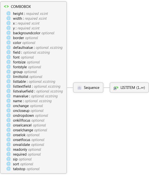
| Name | Type | Use | Default | Fixed | Description |
|---|
| height | xs:int | required | | | The height of the combo box. |
| width | xs:int | required | | | The width of the combo box. |
| x | xs:int | required | | | The x coordinate of the upper left corner of the combo box. |
| y | xs:int | required | | | The y coordinate of the upper left corner of the combo box |
| backgroundcolor | | optional | | | The background color to use for the combo box. If not specified, this value is inherited from the page's backgroundcolor attribute. |
| border | Restriction of xs:string | optional | false | | Specifies whether the combo box has a border. |
| color | | optional | | | The color to use for the combo box's text. If not specified, this value is inherited from the page's color attribute. |
| defaultvalue | xs:string | optional | | | A simple expression that specifies the default value of the combo box. |
| field | xs:string | optional | | | The field of the shapefile's DBF table that is linked to the combo box. |
| font | | optional | | | The font to use for the combo box's text. If not specified, this value is inherited from the page's font attribute. |
| fontsize | Restriction of xs:int | optional | | | The font size to use for the combo box's text. If not specified, this value is inherited from the page's fontsize attribute. |
| fontstyle | Restriction of xs:string | optional | regular | | The font style to use for the combo box's text. If not specified, this value is inherited from the page's fontstyle attribute. If the value is not regular, it can be any combination of other values, expressed as a comma delimited list (for example, fontstyle="bold,underline"). |
| group | Restriction of xs:string | optional | false | | Specifies whether the combo box starts a new group of controls. |
| limittolist | Restriction of xs:string | optional | true | | Specifies if the text box portion of the combo box can accept text. |
| listtable | xs:string | optional | | | The DBF table used to populate the combo box. |
| listtextfield | xs:string | optional | | | The field of the DBF table that contains the data used to populate the text component of the combo box's items. |
| listvaluefield | xs:string | optional | | | The field of the DBF table that contains the data used to populate the value component of the combo box's items. |
| maxvalue | xs:string | optional | | | Specifies the maximum value allowed for the control. This can be a numeric or text value. |
| name | xs:string | optional | | | Name of the ComboBox control. Used to reference the control in scripts. |
| onchange | | optional | | | Specify the script to run when this event occurs. |
| oncloseup | | optional | | | Specify the script to run when this event occurs. |
| ondropdown | | optional | | | Specify the script to run when this event occurs. |
| onkillfocus | | optional | | | Specify the script to run when this event occurs. |
| onselcancel | | optional | | | Specify the script to run when this event occurs. |
| onselchange | | optional | | | Specify the script to run when this event occurs. |
| onselok | | optional | | | Specify the script to run when this event occurs. |
| onsetfocus | | optional | | | Specify the script to run when this event occurs. |
| onvalidate | | optional | | | Specify the script to run when this event occurs. |
| readonly | Restriction of xs:string | optional | false | | Specifies whether the combo box's value can be modified by the user. |
| required | Restriction of xs:string | optional | false | | Specifies if the user must enter some text in the combo box. |
| sip | Restriction of xs:string | optional | auto | | Specifies if the SIP (soft input panel) is displayed on pen devices when the combo box gets the focus. |
| sort | Restriction of xs:string | optional | true | | Specifies if the items in the combo box are automatically sorted alphabetically. |
| tabstop | Restriction of xs:string | optional | true | | Specifies whether the TAB key can be used to move the focus to the combo box. |


