Have you ever looked at a map of crime in your city and tried to figure out what areas have high crime rates? Or looked at different types of information, like school locations, parks, and demographics, and tried to determine the best location to buy a new home? Whenever we look at a map, we inherently start turning that map into information by finding patterns, assessing trends, or making decisions. This process is called spatial analysis, and it’s what our eyes and minds do naturally whenever we look at a map.
Whether it’s a statistical analysis to determine if the patterns that we see are significant, or it’s an imagery analysis to detect change in vegetation over time, the spatial analysis tools that are part of the ArcGIS system empower you to answer questions and make important decisions using more than a simple visual analysis. Let’s take a look at three examples that can be started using a simple visual analysis, but can be enhanced using ArcGIS: finding significant hot spots of crime, mapping vegetation loss, and siting evacuation clinics in the event of a natural disaster.
Example 1: Finding clusters
Putting your data on a map is an important first step for finding patterns and understanding trends. Here we’re looking at crimes that happened in San Francisco…about 37,000 of them. Looking at the points on a map, can you find the clusters or patterns in this point data? Can you decide where the police department should allocate its resources? Just looking at points on a map is often not enough to answer questions or make decisions using this kind of point data. That’s where the spatial analysis tools in ArcGIS come in.

We’ve all seen heat maps on TV or in web application—beautiful maps that show high-density areas in bright red, and low-density areas in blue. These maps are used to visualize crime, disease, foreclosures, and a whole host of other types of data and information. These heat maps can be a great first step in a visual analysis of your data, but they can also be very subjective. What does that mean? Well, the two heat maps shown below reflect the same San Francisco Crime data, and were created using the same tool. The only difference is the criteria that were used to decide what appears bright red and what appears dark blue. These types of cartographic elements that we incorporate into our maps can have a huge impact on the story that the map tells.
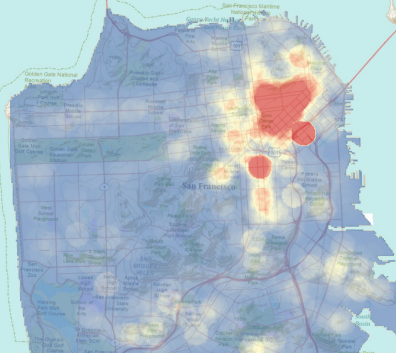
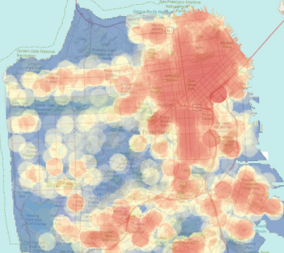
If the decisions that you’re trying to make as a result of your analyses are important, and they usually are, you’ll want to minimize subjectivity as much as possible. A great way to minimize the subjectivity in your pattern analysis is to use a hot spot analysis, which incorporates a simple spatial statistic to determine if the patterns that you’re seeing are statistically significant or not. The hot spot map is shown here. 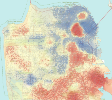


So what makes this type of map any less subjective than density-based heat maps? The areas in red on hot spot maps are statistically significant clusters of high values (hot spots), and the areas in blue are statistically significant clusters of low values (cold spots). What’s red and what’s blue is always based on statistical significance. Using hot spot analysis, we can feel confident in the spatial patterns that we see, and in the decisions that we make.
And, if you want to run your own hot spot analyses, you can explore this simple web application.
Example 2: Mapping change
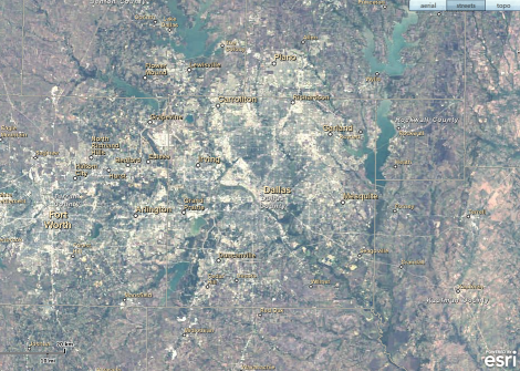
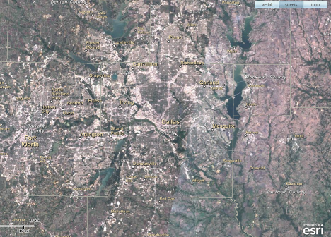
Mapping the changing conditions in a place over time, like loss of vegetation, can help us anticipate future conditions and implement policies that will positively impact our world. In this example, we’re looking at two maps of Dallas, Texas. The map on the left is from 1990, and the map on the right is from 2005. Can you tell if the Dallas area has experienced an increase or decrease in vegetation over the past 15 years? Which areas have experienced the biggest decreases? The biggest increases? Where would you suggest that decision makers in Dallas look into promoting green space and building new parks? Looking at these two maps side-by-side, it can be hard to tell what, if any, changes have occurred over the 15-year period, and even harder to pinpoint exactly where those changes have happened.
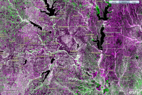
This map shows the results of a spatial analysis of the imagery. The imagery from the first time period and the imagery from the second time period are compared pixel by pixel, looking for changes over time. Areas in pink are those areas where vegetation decreased in the 15-year period, and areas in green reflect increased vegetation. Not only does this analysis make it easy to see that overall the Dallas area has experienced a dramatic decrease in vegetation in this 15-year period, it also illuminates exactly where those losses happened. This type of analysis can help these communities better plan for the future, with a clear picture of changing conditions in their community over time.
You can do your own change detection, and explore how things have changed over time all over the world, at the Change Matters website, or take a guided tour using ArcGIS Landsat image services to explore changes to the earth.
Example 3: Finding the closest
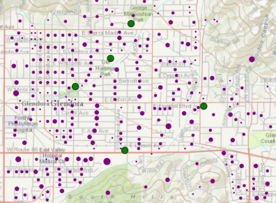
Road networks play a very important role in decisions that range from siting fire stations to routing deliveries to responding to natural disasters. In this example, a flood is happening in Glendora, California, and over 25,000 people need to evacuate their homes. The local government only has enough staff and resources to open two evacuation centers. The purple dots represent the blocks that need to be evacuated, and each green dot is a potential facility that can be used as an evacuation center. Can you tell which two evacuation centers will minimize the travel time for all evacuees? Looking at the map we may be able to take a guess, but without more advanced spatial analysis it is hard to say for sure. And when the decision is as important as providing shelter in the event of an emergency, we want to be sure.
Another advantage of using network analysis is that if you have additional information about road closures or traffic, the results will reflect that information. This web application allows you to choose the number of facilities available for evacuations, create barriers to travel within the road network, and ultimately run your own analysis to see if your best guess matches up with the right solution.
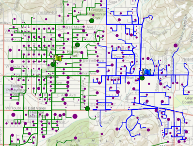
This map shows the results of a network analysis called location-allocation that minimizes the travel for all of the people that need to evacuate. It uses the road network to determine the travel time from each household to potential evacuation facilities, and chooses the best facilities based on hundreds of thousands of combinations of travel-time calculations. Do the chosen facilities match your guess?
Resources for learning more
These are just a few examples of the power of spatial analysis to help you extend what your eyes and mind do naturally whenever you look at a map. You can learn more about the hundreds of applications of spatial analysis at the following resources.
To learn more about spatial analysis, visit the Spatial Statistics Blog or the Analysis and Geoprocessing Resource Center
To learn more about imagery analysis, visit the Imagery Resource Center
This story was contributed by Lauren Rosenshein, analysis and geoprocessing team